According to a Forbes’s article on the importance of search, about 93% of all online interactions between a consumer and a brand still begin “the old fashioned way” – with a search engine. But more than that, about 70% of the links that search users click on are organic – meaning that most people (to the tune of about 70 to 80%, as per the aforementioned study) tend to ignore paid ads on engines like Google entirely, instead focusing on the organic results.
All of this means that when people go looking for a financial advisor, the vast majority of the time they’re going to discover your business in the exact same way – via your website. With that in mind, financial advisor web design doesn’t just become important.
It becomes critical.
This is something that can be both your biggest asset and your largest liability depending on your approach to the proceedings. It’s something I was explaining to one of my newer clients on the phone, just the other day, as we were discussing certain changes that I wanted to make to his website.
If you would like us to review your homepage for conversion, schedule a strategy call today.
“There are certain elements that you have here that I just don’t understand,” he said to me. “Why would I put my call to action so far up on the page? Why do we have everything grouped together like this? A lot of these choices are so different from most of the other sites I see. Is that okay?”
It’s more than okay. In a lot of ways, that’s kind of the point.
Because while it’s true that your organization is totally unique from other financial advisory firms out there, the techniques that you’ll use to create a better, faster and stronger connection with the members of your own target audience are not. With that in mind, here are some of the top financial advisor web design examples that perfectly illustrate what I’m talking about. Not only do they all attract and convert… many of them literally convert in less than five seconds.
Top Financial Advisor Web Design: Camarda Wealth Advisory Group
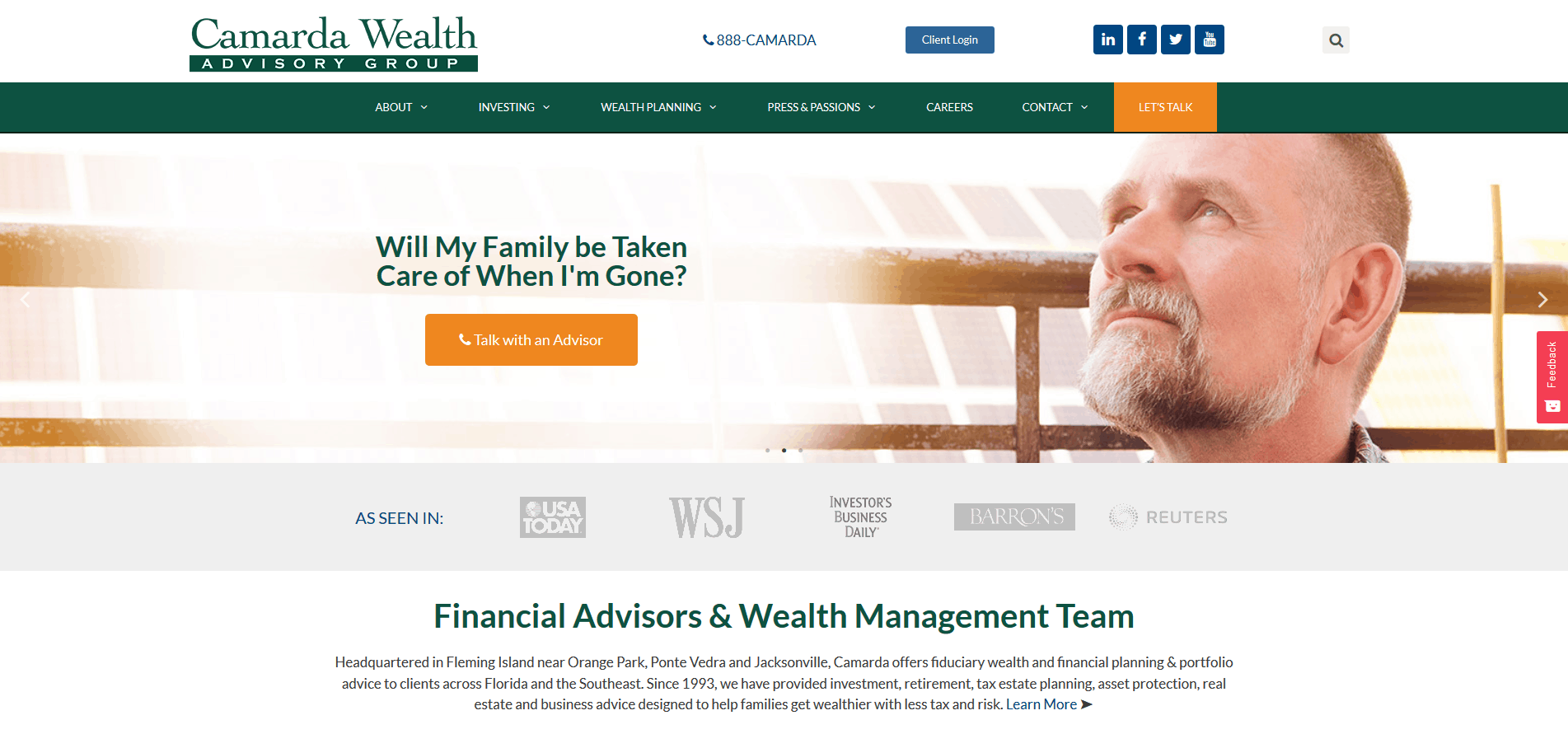 If brevity is the soul of wit, it’s also the soul of effective financial advisor web design – as the Jacksonville-based Camarda Wealth Advisory Group’s homepage goes a long way towards proving.
When people go looking for a new financial advisor to work with, what they’re really looking for is someone who understands their unique pain points and concerns. Camarda proves that they do just that right away, with a short but incredibly effective series of opening statements like “How do I generate income in retirement?” and “will my family be taken care of when I’m gone?” They also have a call to action to set up a strategy call with an advisor above the fold – meaning that the time it takes someone to confirm they’re in the right place and take the next desired step is literally seconds.
Financial Synergies Wealth Advisors

The website of Financial Synergies Wealth Advisors takes a similar approach in that they instantly confirm that they understand someone’s pain points, but they do so in a slightly different way. Right away, you see a series of additional statements in the slides that not only speak to what FINSYN is capable of, but also act as a guide in reference to the prospect’s potential pain points. It’s an expert display of sympathy and empathy in an impressively short amount of time.
Immediately, you learn that they can A) help you build lifelong wealth, can B) offer a complete integration of all aspects of your financial life, and C) generate the peace-of-mind that you need to pursue your dreams.
All of these statements immediately connect with the prospect in a way that resonates, because they can SEE how the FINSYN process works.
Alpha Fiduciary Generational Wealth Management
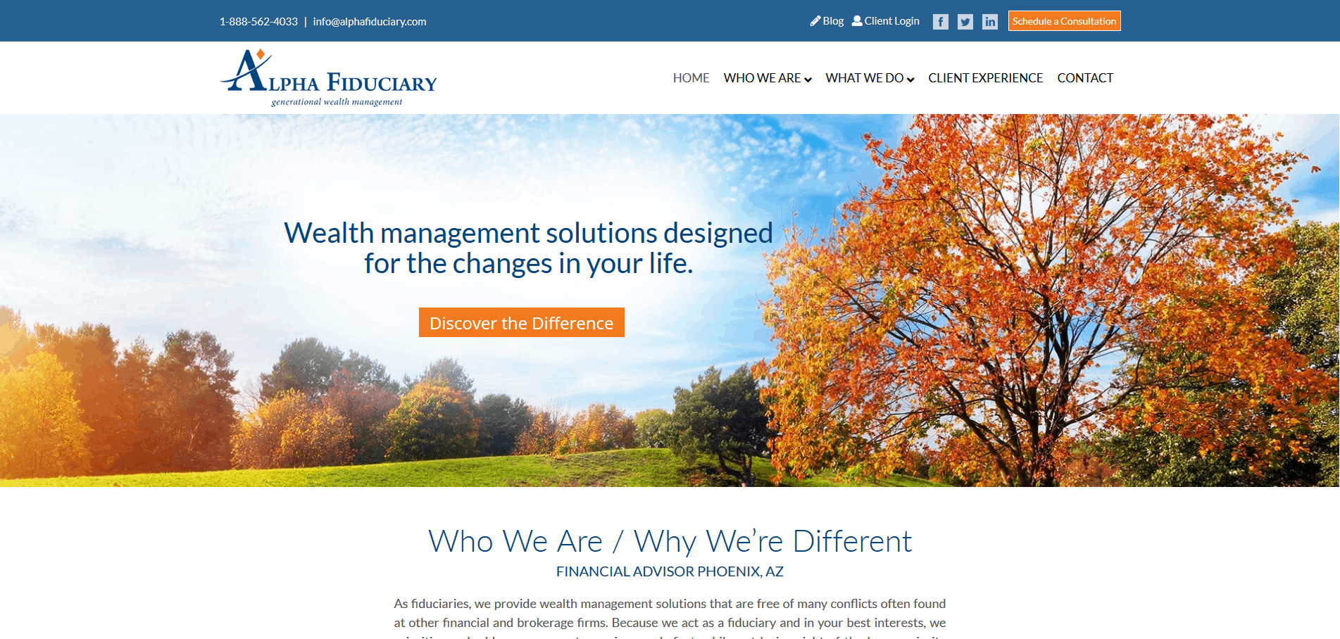
The website of Alpha Fiduciary Generational Wealth Management is particularly notable because they don’t just confirm what they do right away (“wealth management solutions designed for the changes in your life”), but they also help solidify that nobody does what they do quite like how they do it.
The “Who We Are/Why We’re Different” section right up front is particularly important, as it immediately lets Alpha Fiduciary separate themselves from their competitors, and do it on their own terms. They’re telling a narrative that they control completely, and are instantly conveying that they should be trusted and that their innovative approach to wealth management is likely just what people are looking for in and around the Phoenix, Arizona area.
Overall, this is a great example of positioning a company as the “hero” in the prospect’s story, as it follows the StoryBrand framework very well. It’s less about telling you what Alpha Fiduciary can do in a general sense, and is more about conveying what they can do FOR YOU. It positions Alpha Fiduciary as a “guide” instead of a services provider, which is ultimately the main goal.
Vector Wealth Management
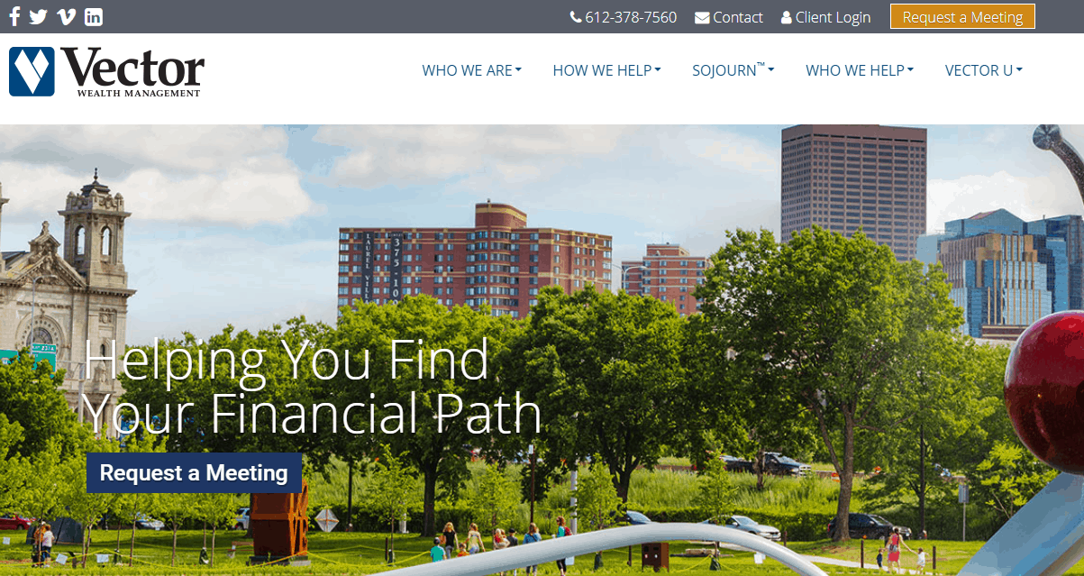
Vector Wealth Management’s homepage is great because once again, you get a compelling call to action above the fold. This underlines something that a lot of experts agree on, particularly people like Neil Patel – if you want someone to take your desired action, you need to make it as easy as possible for them to do so. In this specific case, there is a consistent call to action on the homepage to “Request a Meeting,” which of course leads to a form that sets up said meeting.
Some firms like a form and handle the meeting set up through a subsequent phone call, while others like to see their calendar get filled up directly using Accuity or Calendly. Either approach is perfectly acceptable.
In truth, the entire page is great because it provides a very high level overview of what the team at Vector actually do, but in ways that are easy for everyone to understand. The flat icons really bring out the company’s unique value proposition so that prospects can easily SEE the essential brand statements that make the firm unique – all in a five second window.
Through sections like “Who We Are” and “Sojourn,” visitors are immediately getting a sense that these people get what someone needs to accomplish in terms of wealth management, and that they’ve found a team of people who are every bit as trustworthy as they are passionate. Never underestimate the importance of those two things in someone’s mind.
Minerva Planning Group
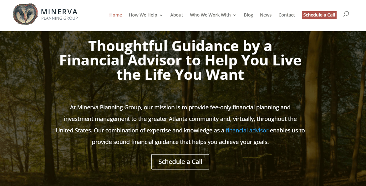
Last but not least we have the homepage of Minerva Planning Group, which once again manages to check a number of pretty important boxes all at the same time. In addition to another call to action above the fold, the language on Minerva’s website isn’t focused on their company so much as what their company can do for their prospects.
So instead of an “About Us” section right away, you get “How We Help.” This conveys similar information, but in a way that puts the customer front and center. That trend continues in “Who We Work With,” “Discover Our Difference” and more – all of which blend together to create a perfect encapsulation of the top financial advisor web design trends that more people need to be paying attention to.
Overall, the Minerva website does an exceptionally good job at placing the prospect front and center within the StoryBrand framework. It is also a wonderfully effective example of the “less is more approach” – it uses more text and less visualization and runs faster vertically down the page, all of which creates a better and more informed experience for visitors.
The Laws of Conversion
In the end, these examples illustrate something that I’ve always considered to be a very important part of the LeadGenFormula – that you have five seconds to convert and that you must design your website so that absolutely plays to the strengths that make your advisory firm unique. You must also do it in a way that speaks directly to your audience members as quickly as possible.
What you’re left with is something of a perfect storm in the best possible way. Not only are people instantly certain that they’ve arrived in the right place via a search engine, but your authoritativeness and your trustworthiness as their solution are conveyed loud and clear and the action you want them to take is loud and clear. When all of these work together, and you couple it to an aggressive inbound strategy, you see the leads come rolling in.
A lot of the pages I referenced above generate between five and 15 leads per month, every month. And isn’t that the measure of a successful digital marketing program?
If you would like us to review your homepage for conversion, schedule a strategy call today.
